
KIM COURVOISIER - MAY 30, 2017
Emails that look awesome
Want an email that looks awesome and converts like crazy?
We joined forces with the talented crew from Really Good Emails to take the guesswork out of designing an excellent email with this email design guide and checklist that’ll make every email you send more awesome.
In this guide, we’ll cover email design best practices for all the different elements of your email campaigns and have a bonus checklist for you at the end. So let’s get to it.
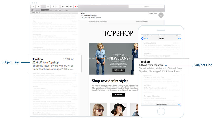
Subject Line
While not a traditional “design element” your subject line is considered one of the most important factors in getting your email opened so your subscribers can see your sweet design so make it engaging, personal, and relevant. Remember, that overuse of CAPS and unnecessary punctuation, as well as some words, can trigger spam filters so respect your subscribers and don’t go there. Use these words instead.
Bonus: CoSchedule has an excellent Headline Analyzer that could also be applied to email subject lines.
Is longer better?
When it comes to email subject lines longer isn’t necessarily better. It’s important to keep in mind that your subscribers use a variety of different browsers and email clients as well as mobile devices to consume your emails.
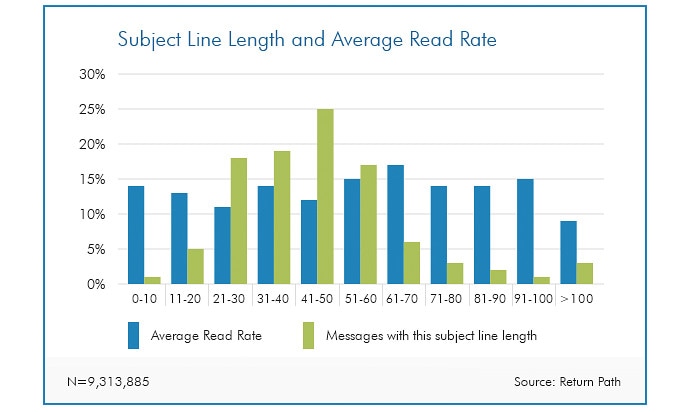
According to data from Return Path, 65 characters seems to be a sweet spot for email subject lines, which is about 15 characters more than the average subject line. When subject lines are 61-70 characters long, they tend to get read. However, most email subject lines are between 41 and 50 characters.
According to data from Return Path, 65 characters seems to be a sweet spot for email subject lines, which is about 15 characters more than the average subject line. When subject lines are 61-70 characters long, they tend to get read. However, most email subject lines are between 41 and 50 characters.
What about symbols in subject lines?
The saying “a picture is worth a thousand words” may never be more true than when it comes to emoji. And emoji in email subject lines can have a major impact. Not only can they take the place of words, be attention-grabbing, and add a definite charm, they can increase your open rates. A report by Experian noted that fifty-six percent of brands using emoji in their email subject lines had a higher unique open rate. Consider us 👍.

Things to keep in mind
If an emoji isn’t supported in the email client, the recipient may see a ☐ character instead.
Remember: Gmail has to have some extra special considerations when using emoji. You may notice in Gmail when you use emoji in the subject line the icon will look different in the inbox view and after the email has been opened. This is due to the inbox view using the Android version of the emoji, meanwhile, the opened email view uses Google’s own emoji style. While the emoji basically look the same, it’s still worth testing to make sure the same sentiment is expressed in both versions.
In addition, for Inbox by Gmail, it’s currently not possible to insert emoticons in Inbox messages using the browser versio
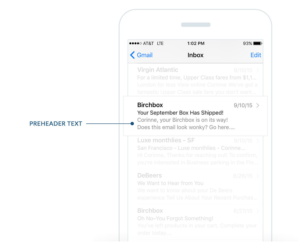
Preheader
Your preheader can be visible in the inbox preview and in the body of your email, or just in the preview pane if you want to save email real estate. Preheaders add valuable context to your subject line and can help your open rate. Keep it short (between 40-70 characters) and to the point. Use this space to help your customer know why the email is useful to them. Your subject line and preheader text should work together.
Personalization
Emails with personalized subject lines are 26% more likely to be opened. Go beyond just using your subscriber’s name in the subject line and use other data you have to fuel super relevant messages.
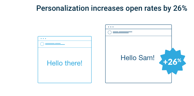
Adding company name, last purchase, or other information helps you to personalize the email in the perfect way for each subscriber. But really good personalization involves more than just injecting a first name. Think about how you could completely change the email based on someone’s information.
Stop thinking of emails as one-to-many and think about them as one-to-one—where each email is customized to each subscriber.
Stop thinking of emails as one-to-many and think about them as one-to-one—where each email is customized to each subscriber.
Email Layout
Your email layout should help the viewer know what they should check out first, and where they can go from there. They should be able to scan the email quickly using a logical hierarchy with large headlines and images focusing the attention. Use layout to break up space and help create chunks of content.
Inverted Pyramid
We’re big fans of the inverted pyramid model. It’s essentially a framework for structuring the elements of your email campaigns (headers, imagery, buttons, etc) so they work together to draw people in, deliver the key messages of your campaign and get them to click-through.
Inverted Pyramid
We’re big fans of the inverted pyramid model. It’s essentially a framework for structuring the elements of your email campaigns (headers, imagery, buttons, etc) so they work together to draw people in, deliver the key messages of your campaign and get them to click-through.
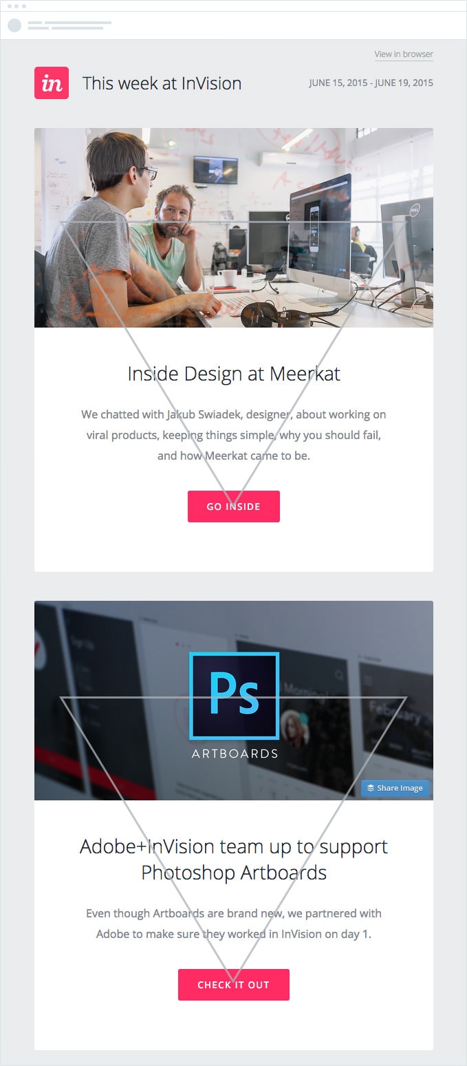
By guiding a subscriber’s eye down the page to your CTA, you’ll encourage them to click through to explore more of what you have to offer, resulting in better brand awareness, more web traffic, and ultimately more sales.
Want to learn more?
This is an awesome article on how to design effective newsletters. Take a moment and check out the full version.
Email Tracking
Simple and free email tracking for Gmail.
- Track the emails you send with Gmail
- Know when they're opened
- Take action
 RSS Feed

