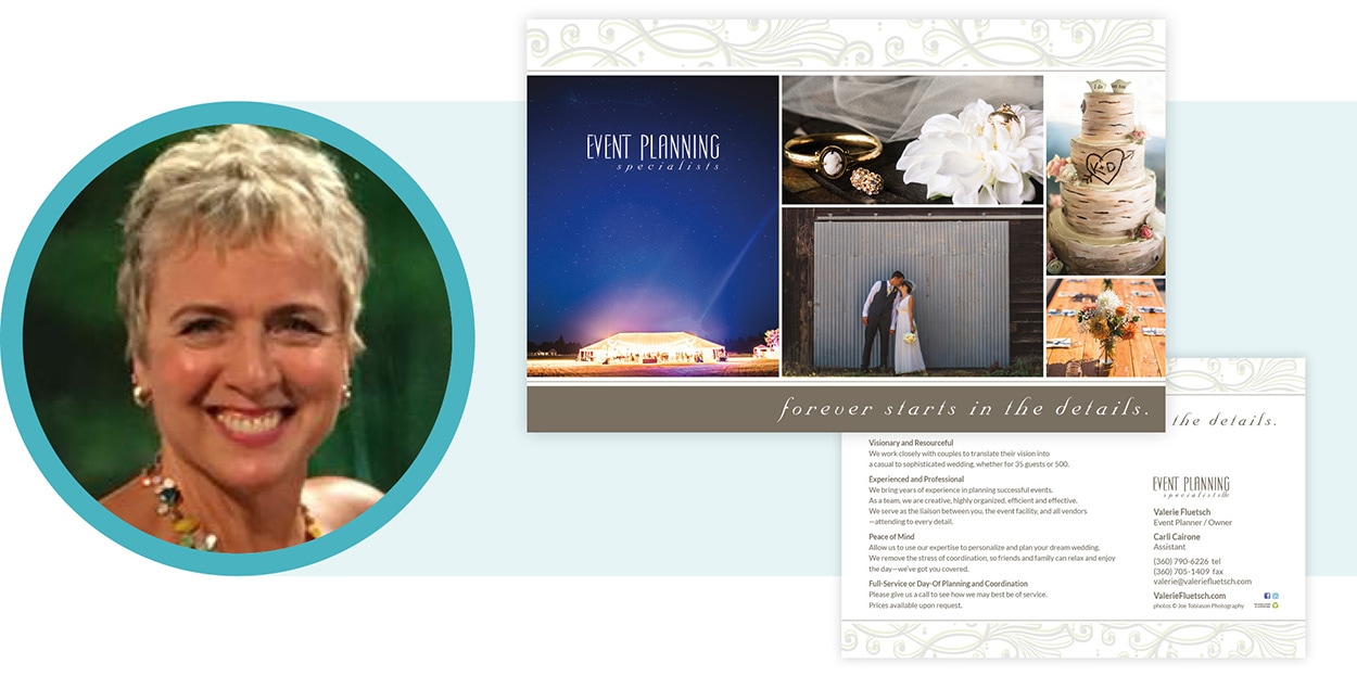
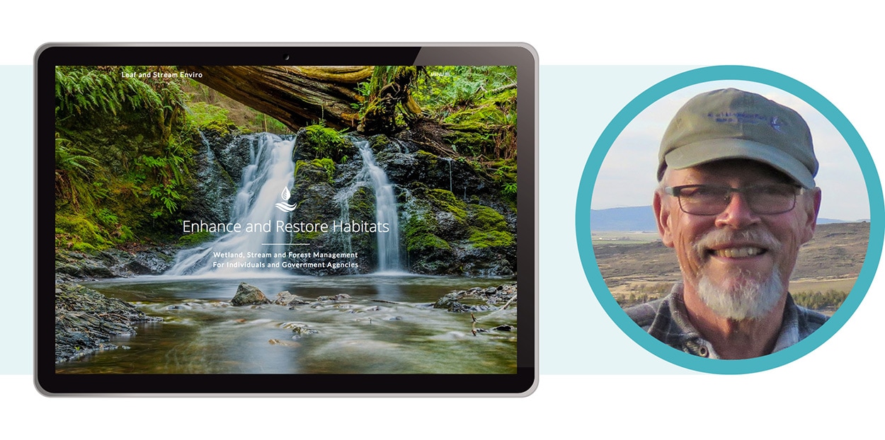
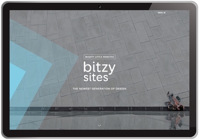
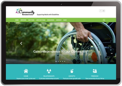
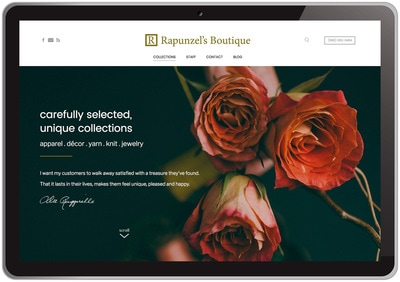
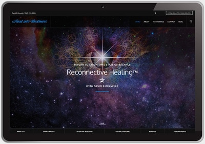
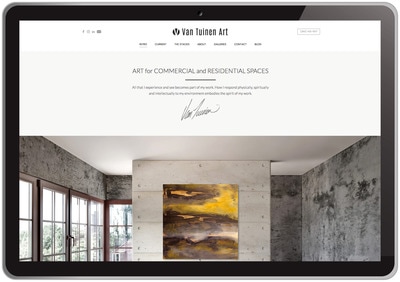
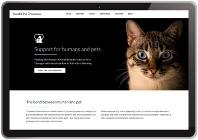
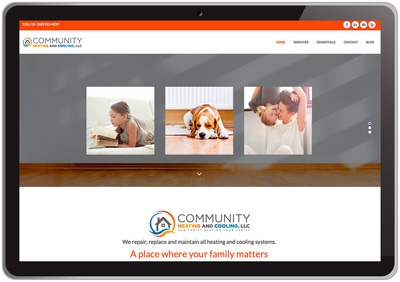
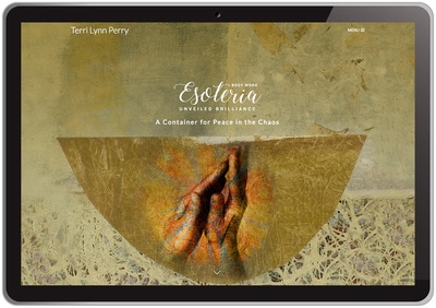
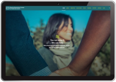
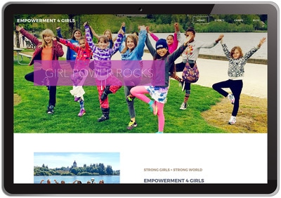
33 image design
  • About
  • Web
  • Print
  • Current
  • Testimonials
  • Q&A
  • Contact
  • Blog

Design a Landing Page That Converts

6/24/2020

1 Comment

 
Picture
By Victoria Martinez

The essential goal of landing pages is to convert visitors into customers. Marketers, designers, and copywriters work closely together to achieve leads and conversions. The difference between a website’s homepage and a landing page is the information they gather and its purpose. Where homepages share general information about the business, landing pages seek an intention from the visitor. It can be to offer a new subscription plan, download a freebie, or to sign up for a newsletter.

Whatever it is the purpose of your landing page, make sure it sticks to just one. One of the most common mistakes is to ask visitors to do many things at the same time.

Below we tell you how you offer your visitors the right information they were looking for and convert them to customers.

Purpose
Determine the purpose of your landing page. What do you want users to do at it? Are you offering a new subscription plan? Are you launching a campaign to obtain new users? Or do you just release new functionality and want people to discover? After answering these questions, you’ll get the main purpose of your landing page and you’ll be able to adjust it seamlessly.

Tip: Landing pages can only serve a single purpose. Don’t try to fill your page for two different things. The more you try to sell the fewer chances of getting leads.


Copy
Creative and original copywriting is a must. Write a compelling headline and subheading to attract readers to your product. Keep it simple and use no more than 10 words to achieve a great performance to avoid confusion on your visitors. Apart from a creative headline, there are other relevant aspects related to copy that will determine the success of your landing.

One of them is the Unique Value Proposition. The UVP is what you offer and it’s also what sets you apart from the competitors. And it should be seen throughout the texts of your landing page. Outline the benefits of your service and reduce it to the minimum, just a few powerful words will have more impact on your users. Another aspect you have to bear in mind is SEO and keywords. This will determine the success of your landing page, do research of the most-used keywords related to your business and competitors, and make sure to include them. Finally, regarding text and copy, grammatical errors or typos cannot happen. Would you trust a company that contains spelling mistakes in the first sentence you read from them? It’s a simple and easy thing to do, just spell-check your landing page before it’s too late.

Visual content
The visual content is one of the key aspects when designing landing pages. An eye-catching image or video of your product or service that perfectly matches the copy will help you drive conversions. The images must relate to the copy to have a greater impact, and should go with the brand’s personality.

Check out freepik resources, whether you opt for photographs or illustrations, we get you covered! Browse collections to refine what you are looking for and make your landing page visuals stand out! 

Use of color
The first thing that visitors will see is colors. First impressions matter, so make sure the color palette you choose matches the overall purpose of the landing page and is nicely picked. From the images or illustrations, you’ll use the background color or the CTA button. This aspect has to be carefully picked in order to achieve harmony throughout the site. Make the most of colors and its psychology, depending on your product or service, the emotion you’ll want to evoke, or the brand’s personality.

CTA
A Call-to-action is needed to convert our visitors into leads. Subscribe,  sign up, apply now, free trial, these are some of the most used CTA actions businesses use to convert visitors. They should always appear above the fold and the size, color or form are aspects to have in mind. They should be bold and striking, they are action-oriented so they need to stand out from the rest of the text. The button color should be in line with the whole site but the ones that report better results are orange and green.
Responsive design

Today, more than ever, we interact with phones and tablets more than with the computer itself, so thinking the mobile UX design first is not a crazy idea. Make sure your landing page looks good in all devices, as most users navigate the internet while on their smartphones, so it would be a mistake to not include them in your strategic plan. From filling a form to signing up for a new service, you should make visitors’ life easy, or you will lose all chances of converting them into customers.

Benefits
This is your chance to list all of your features and benefits. Keep your benefits in bullet points in order to make it more visual and appealing.

Tip: Some businesses offer a freebie in exchange for the email information. Think of what your visitors would really want, is it a free guide, a checklist, make this an opportunity to get some information about your users!

Testimonials
Providing testimonials from happy customers can improve the chances of getting newcomers. And it can be reassuring for the ones who are doubting. That testimonial can come in a video format, tweet, or quotes. With “What our users say” section you’ll be more likely to trust. Potential customers are always checking reviews, so don’t hesitate to include it in your own landing page. They won’t have to leave the site to check it.

Keep it simple
Most of the time, less is more. And for landing pages, it surely applies. Remove the navigation menu and any other unnecessary distraction from the site. You’ll get more chances to drive conversions.

On a landing page, we should keep everything we can above the fold. If you are unfamiliar with the term, it refers to the web content we see when a site loads, if we need to scroll, that would be below the fold. For that reason, the information should be clear and direct.

A/B Testing
This is the final step for your landing page. After doing the hard work you may find your landing page not working how you expect it to. Why? Well, customers may not find it attractive or trustworthy enough to complete the journey. A/B testing allows you to compare two versions of the same landing page, change the headline or subheadline, or the color of the CTA, and get the results of which performed better.

Resources
We hope these steps works for you and your landing page,  and if you’re in the need of some beautiful assets for your landing page, here’s a bunch of them:
  • Free landing pages templates for your online shopping business
  • Collection of high-quality colorful illustrations for your page
  • Landing pages templates with nature vibes
  • Responsive landing pages templates
  • Landing page ideas for any business
Read the Full Blog

About the author

Victoria Martinez
Vicky is a Spanish translator and content creator for Freepik Company. Her love for languages and adventures took her to a French island in the middle of the Pacific to teach Spanish. Now back in Spain, she has dived into a new world of possibilities thanks to Graphic Design. In her free time, though, this language geek loves planning scuba diving trips that will happen eventually.
1 Comment

Weebly Tutorial

4/8/2020

0 Comments

 
Picture
Picture
By Quang Tran, of baamboo studio
Baamboo studio is a trusted partner in my website design industry. Many, if not most of my websites are designed using their custom templates to elevate the design. Quang Tran of baamboo has put together a comprehensive Weebly Tutorial that helps demystify the steps for designing a Weebly website.
Whether it’s sharing your words and ideas or selling your products, one thing is pretty apparent. If you want to effectively reach your audience, online is where you need to be. Moreover, what better way to establish your presence online than to building an outstanding Weebly business site or Weebly online store or blog?

Now, we know what you’re thinking. You don’t have programming, coding, or any website-building knowledge. How are you going to come up with a website, let alone a brilliant one? Well, that’s where this Weebly tutorial comes in.

A Step-by-Step Guide
0 Comments

Privacy Policy

5/21/2018

0 Comments

 
Privacy Policy

Do you have a website?

Have you noticed that everyone is updating their privacy policy?

​There's a reason for that.

Picture
WEEBLY UPDATE
Weebly
May 18, 2018
Weebly is committed to helping people create great websites and online businesses. As part of our growth and in support of the upcoming General Data Protection Regulation (GDPR), we’re launching new tools and features and updating our Privacy Notice.

Here’s what we’re working on:

Improved GDPR Privacy Notice. The upcoming General Data Protection Regulation places new obligations on organizations that process EU personal data. As a result, we’re updating our Privacy Notice and Terms of Service to better explain our relationship with you. We’re making our Privacy Notice clearer by defining key terms, describing our data processing practices and including examples showing how Weebly implements this Policy. We’ll let you know when it’s available online for you to review.

Helping you towards compliance on your Weebly website.
  1. We have published content to help you understand and prepare for GDPR.
  2. We’ll be providing you with an updated cookie banner to display on your website and have added a privacy policy generator that you can utilize as part of your process to become GDPR compliant.
  3. We are also creating a process to help you respond to individual rights requests.
We will be sending out more information in the upcoming weeks, so stay tuned. If you have questions, please reach out to us at hc.weebly.com.

We hope these updates will help make creating and using your website or online store easier. Please note that nothing in this notice constitutes legal advice.
Picture
ACTION REQUIRED

Privacy Policy Generator

Free Privacy Policy Template
  • Build trust with customers. Let them know that you care about protecting their private information.
  • Make sure you're following the law. If you're collecting any personal data, a privacy policy is required.
  • A privacy policy helps you avoid legal fines.
It's easy to generate your privacy policy.
Create Your Policy
This makes my head hurt. Will you do it for me?
Yes! Learn More
Picture
I asked Debi to update my privacy policy because I knew that the privacy policy issue was not one that was just going to go away. It felt worth the small amount of money that it would take to bring my website into compliance and up to date.

Updating my privacy policy also gives me the flexibility to grow my online presence in a way that I may not be anticipating now but that may surface in the years to come.

Debi made the process easy and was thorough in her approach to this issue. It just seemed like a no brainer to me and I am happy with how Debi approached this for me and for my business.

Jillian Ayer
Jillian Ayer
J. Ayer Massage
Picture
GOOD IDEA
Picture

Get expert advice in your inbox.

Take a moment and subscribe to Weebly's blog for the latest news and inspiration.

[Scroll to the bottom/right to join the club.]
Join the Club
0 Comments

Writing for the Web: Timeless Rules

7/19/2017

0 Comments

 
Website Content

Great Website Content

Your website advertises something. Whether it's a business, a portfolio, or just an idea, all websites aim to persuade visitors to read more or take some kind of action.
David Ogilvy
From the 1950s through the 1980s, no one was better at getting potential customers to take action than the late David Ogilvy, colloquially known as the father of modern advertising and founder of the multi-national ad agency Ogilvy & Mather.In September of 1982, Ogilvy wrote a memo to agency staff titled simply "How to Write."
Within he listed 10 tips that are still shared in writing circles and should be required reading for anyone trying to build a business online. They apply remarkably well when writing for the web today. Here's all 10:

Key Themes:
Clarity, Brevity, Accuracy

Ogilvy's list leaves little to the imagination. His strong belief is that clear, concise copy is what serves clients and consumers best. Scientific research says that he's right.
  1. Read the Roman-Raphaelson book on writing. Read it three times.
  2. Write the way you talk. Naturally.
  3. Use short words, short sentences and short paragraphs.
  4. Never use jargon words like reconceptualize, demassification, attitudinally, judgmentally. They are hallmarks of a pretentious [fool].
  5. Never write more than two pages on any subject.
  6. Check your quotations.
  7. Never send a letter or a memo on the day you write it. Read it aloud the next morning—and then edit it.
  8. If it is something important, get a colleague to improve it.
  9. Before you send your letter or your memo, make sure it is crystal clear what you want the recipient to do.
  10. If you want ACTION, don't write. Go and tell the guy what you want.

Read the full article

Buy the Book

Writing That Works, 3rd Edition:
How to Communicate Effectively in Business

by Kenneth Roman and Joel Raphaelson
Writing That Works will help you say what you want to say, with less difficulty and more confidence. Now in its third edition, this completely updated classic has been expanded to included all new advice on e-mail and the e-writing world, plus a fresh point of view on political correctness.

With dozens of examples, many of them new, and useful tips for…

Writing That Works

About the Author

TIM BEYERS
Tim is a freelance business writer. He writes about the business of innovation, comics and genre entertainment on The Full Bleed.

Tim Beyers
0 Comments

Making it easy in print and on the web

3/10/2017

0 Comments

 
Making it easy

Big Leaps Forward

4 unique people taking big leaps forward in being visible and sharing their services.

Marketing Packet


Janette Eckert

After years of creating individual marketing pieces, Janette Eckert of Alpine Ductless Heating and Air Conditioning, took on the task of creating a new marketing packet including a presentation folder and flyers.

With consistent, cohesive design, it's a beautiful upgrade across the board.
View Packet
Janette Eckert

Website


Debra VanTuinen

National and international artist, Debra VanTuinen, recently updated her website to be mobile friendly and easily accessible to herself and her audience. Debra can now update her portfolios with ease, keeping her presentation current.

With a simple, yet elegant design, her website is easy to maintain and navigate.
Visit Website
Debra VanTuinen

New Services


Valerie Fluestch

Valerie Fluestch has been a successful event planner for years. She recently added Wedding Planning to her list of services and created a postcard/handout to help announce her newest addition.

By creating a handout, she helped define and share her newest offering.
View Postcard
Valerie Fluestch

New Website


Steve Koskella

Steve Koskella has been offering wetland, stream and forest management services for over 25 years. He had a simple, one-page website that was difficult to find and update.

By creating a new website that lists all of his services, testimonials, and projects, Steve has increased his visibility.
Visit Website
Steve Koskella

What happened in web design?


Find out what happened in web design in 2016.
Learn More
0 Comments

2016 Websites - A year in review

3/6/2017

0 Comments

 
The Newest Generation of Design

The Newest Generation of Design

Mobile design
2016 was a landmark, transitional year in web design. The industry standard moved to mobile, responsive, design to read well on all devices—whether you access a website on a phone, computer, or iPad, all of the design elements shrink and expand.

Stackable sections
Because we are a mobile industry it's often easier to read information on a scrolling one-page website than clicking through tabs and pages. As a result, design leans more towards stackable sections, including pictures, illustrations and small amounts of content.

Make it easy and accessible
As a whole, our lives move faster and faster—we review and receive more information than ever before, needing less with easy access. The challenges that brings to design in general is our need to compact and minimize content, while making our 'call to actions' easily accessible. Overall, our audience has less time and patience to click and search websites—'Making it easy and accessible' is the #1 directive in design.

The big questions
The primary questions that need to be easily answered in print and on the web, are:
  1. Who are you? — Your logo and tagline.
  2. What are you offering? — Your services and benefits.
  3. What makes you unique? — What sets you apart and makes you unique.
  4. What do you want me to do? — Your call to action.

Simple, scrolling, one-page websites

Take a whirl through the websites of folks who braved the newest generation of design in 2016.

Individuals and businesses

0 Comments

Courageous Transitions

12/1/2016

0 Comments

 
A Container for Peace in the Chaos

Courage

Taking a step into the unknown is an act of courage.
Graphic
Self Reflection
I recently heard a story of 3 questions that a mother asked her child at bedtime. The story inspired me and I had to think, “How wonderful to teach your child about self reflection at a young age.”

My take-away from the conversation was my own rendition of these questions as a starting point for making positive changes in my life.
Picture
How have I been courageous?

How have I been kind to another?

How have I loved myself?

Transitions

The process or a period of changing from one state or condition to another.
Graphic
The Space Between
Most of the people I work with are in a transitional state of defining what they do in the world--What is their gift and true essence that sets them apart?

Through words and pictures, we work together to create their visual identity for print and on the web. It's an organic, shifting process that requires a lot trust and a commitment in the process of discovery.

The Courageous Act
The courageous act is when people show up to work together saying, "I know what I'm doing is not working, but I'm not sure how to define what I am doing?"

The ability to ask for help is the number one characteristic of successful people. Recognizing when we don't know something, combined with our willingness to take a step and ask for help, defines living a creative life.
Transitions
Terri Lynn Perry
I met a truly courageous person in Terri in late September. She had a successful massage business, shared in a group location. She knew that what she offered was shifting and had already chosen to move to a space of her own.

When we met, she was uncertain of how to move forward in defining her business, as well as financially affording a rebranding of her website. And yet…she mustered the bravery to schedule an appointment to meet and talk about it, with me, a complete stranger. Her level of her commitment and bravery was infectious and I was immediately compelled to help find solutions by asking the questions, "What if…?"

Traveling an unknown path over several months, interspersed with magic and a strong sense of familiarity and ease between us, we finally launched her new website. Each step of the way required copious amounts of courage, trust and a willingness to step into the unknown.

Most notable is that Terri's tagline, A Container for Peace in the Chaos, was unveiled at a time of unrest in our nation—exquisite timing!
Terri Lynn Perry
Esoteria
Visit Online

First Day, First Client

I received this text from Terri on 11/19/16, her first day, first client.
Herein lies my joy…
Picture
I started my first official time with clients today - drew this card this morning before I began. Thought of you - thank you for the beauty and grace you've brought to my life during this momentous transition.
0 Comments

More tools for your website

8/23/2016

1 Comment


Weebly Updates


We’re very excited to announce that this week, we’re releasing a major new update to Weebly called Sections. Sections brings a number of your most highly-requested design features and enhancements to Weebly. Here’s what you’ll see in this release:

Brand-New Header Functionality

We’ve made headers way more powerful, and easier to work with. You will now be able to place elements in headers, and instead of the static header heights, you can now dynamically re-size them however you like!

New Sections Element

You can now add multiple body sections on a single page! By dragging the new Sections element onto a page, you can create groups of elements, which can then be easily moved around a page, or copied to other pages on the site.

Customizable Backgrounds

One of our most highly-requested features is finally here! Your headers and page sections can now have dynamic backgrounds, which you can customize with color, images, and even video. Upload your own videos, or make use of our included library for you to use freely on your site!

Brand New Sections Layouts

Header and page sections now come with more categories, and varieties of layouts. This makes it even easier to get a great-looking website online as quickly as possible!

Themes
Sections will be launching today, but it will only be available to use on themes that have been updated to take advantage of the new features. To make sure that this launch is as smooth as possible, we’ll be slowly updating all themes over the next few weeks. The first theme that will have Sections support is Birdseye. This will be shortly followed by Squared, Brisk, Dusk, Clean Lines, Impact, Journey, and Cento.

We are aiming to have all themes updated by the second week of September.

FAQ

Which Weebly Designer Platform plans will get Sections?

All Sections features will be available with both Pro and Business plans.

Will Sections support the old adaptive themes?

No. Sections will only be available in our current 24 responsive themes. The plans will be updated individually over the several weeks following launch.

How will Sections impact current Client sites?

If a Client site is using a stock Weebly theme that has Sections support, and they have permission to edit any pages, they will have access to Sections. We do not have a Client permission setting for Sections at this time.

Will I be able to opt-in to using a Sections-updated theme?

No. The themes will be updated automatically, behind-the-scenes.

Will custom themes based on stock themes be updated?

No. You will need to start over with a supported stock theme. In the near future, we will have documentation available on our Weebly Developer site to assist with converting custom themes to support Sections.

1 Comment

9 Tips for Domain Names

8/11/2016

0 Comments

 
Choosing a domain name is similar to choosing a company name — it requires a lot of thought and consideration. Your domain name is your identity on the web; you want to make sure you choose a name that not only fits your business, but is also easy to find and promote.

1. Make it easy to type
Finding a domain name that’s easy to type is critical to online success. If you use slang (u instead of you) or words with multiple spellings (express vs. xpress), it might be harder for customers to find your site.

2. Keep it short
If your domain name is long and complex, you risk customers mistyping or misspelling it. Short and simple is the way to go.

3. Use keywords
Try using keywords that describe your business and the services you offer. For example, if you’re a glass replacement business, you may want to register GlassRepair.com or GlassReplacement.com.

Include the keywords that people enter when searching for your products or services.
It helps improve your rank on search engines (which increases traffic) and just makes more sense to your customers.

4. Target your area
If your business is local, consider including your city or state in your domain name to make it easy for local customers to find and remember. Example: PhoenixGlassRepair.com.

5. Avoid numbers and hyphens
Numbers and hyphens are often misunderstood — people who hear your website address don’t know if you’re using a numeral (5) or it’s spelled out (five) or they misplace or forget the dash. If you need these in your domain, register the different variations to be safe.

6. Be memorable
There are millions of registered domain names, so having a domain that’s catchy and memorable is essential. Once you’ve come up with a name, share it with close friends to make sure it sounds appealing and makes sense to others.

7. Research it
Make sure the name you’ve selected isn’t trademarked, copyrighted or being used by another company. It could result in a huge legal mess that could cost you a fortune, as well as your domain!

8. Use an appropriate domain name extension

Extensions are suffixes, such as .com or .net, at the end of web addresses. These can have specific uses, so make sure to choose one that works for your business. The .com domain extension is far and away the most popular, but it can be tough to get a short and memorable .com domain name because it’s been around for so long.

A bevy of new generic top-level domains — like .photography, .nyc and .guru — offer a great opportunity to register short and highly relevant names. And here are some other top extensions and how they’re often used:
  • .co : an abbreviation for company, commerce, and community.
  • .info : informational sites.
  • .net : technical, Internet infrastructure sites.
  • .org : non-commercial organizations and nonprofits.
  • .biz : business or commercial use, like e-commerce sites.
  • .me : blogs, resumes or personal sites.
Pro tip:
You don’t need to build a website for every domain. Just forward any additional domains to your primary website.

9. Protect and build your brand
To protect your brand, you should purchase various domain extensions, as well as misspelled versions of your domain name. This prevents competitors from registering other versions and ensures your customers are directed to your website, even if they mistype it.

Author
Andrea Rowland is a former small business owner and newspaper journalist, and a published nonfiction author, Andrea Rowland helps craft compelling communications for small businesses and web pros through her work as managing editor of the GoDaddy Garage. When she's not writing or editing, she likes to experiment with baking, travel, read, and dip her toes in the ocean.

0 Comments

What You Need to Build a Website

2/8/2016

0 Comments

 
By Connie Wong
Website Builder Expert

Picture
I love checklists. It’s not because I have an obsessive compulsive need to lay out a detail plan for everything I do – okay fine… I do, but it’s not why I like it.

It’s because checklists are great at simplifying complicated or overwhelming projects like building a website – into easily manageable steps.

Everything is nicely laid out for you like an organized road map – so it takes away all the guess work out of building your website.

If you feel completely lost and don’t know where to start when it comes to building a website, you’ve come to the right place.

This checklist will show you exactly:
  1. What you need to get started with a website, and
  2. What you don’t need and probably never need for your website.
If you’ve already done some research and have a rough idea what it takes to build a website, this checklist can help you find out if you missed anything (just in case).  We’ve also linked to some awesome guides to make sure you get off to a good start!

Picture

What You “Think You Need” vs
What You “Actually Need” to Build a Website.

One of the biggest mistake people make when building his or her first website is trying to do too much.

What you end up with is an endless list of things you need to do and things you need to pay for.

Soon you are overwhelmed and end up doing nothing – does this sound familiar?

Read the full article online
0 Comments
<<Previous

    Author

    Debi Bodett is an independent graphic designer for print + web.

    Categories

    All
    Brand
    Business
    Current
    Marketing
    Movies
    Photography
    Resources
    Website Design


    RSS Feed


Getting around

Home    |    About    |    Web    |    Print    |    Current    |    Testimonials    |    Q&A    |    Contact    |    Blog
Picture
Privacy Policy
Join my list!

Inspired design for print + web  |  33 image design  |  Debi Bodett  |  Olympia WA  |  (360) 754-7345

share

©2017

33 image design